ShopDreamUp AI ArtDreamUp

Deviation Actions


Suggested Deviants


Suggested Collections


You Might Like…


Featured in Groups

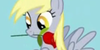


Description
Oh, and once I learn to properly shade, I might come back thru and update this.
*AI HERE [link]
*ORIGIONAL SKETCH By
 *
**Vector By

*You may use this vector if you Credit me properly.
*All MLP:FiM characters and what not, belong to Hasbro.
Image size
7762x8314px 1.22 MB
© 2012 - 2024 TryHardBrony
Comments27
Join the community to add your comment. Already a deviant? Log In
Overall, I would have to say that this is a high quality vector. I can tell that you know what you are doing and most of the mistakes I usually see when I am working on new vectors or looking at other people's are not present. In fact, from the quality of this, I would expect you to be a viable contributor to <img class="avatar" src="a.deviantart.net/avatars/m/l/m…" alt="
 " title="MLP-VectorClub" />. However, there are a few places that I think you could improve thjs. Several of these come from the fact that you were working from someone else's pencil sketch. Vectors and pencils have different properties and carrying them over can detract from the overall appeal.
First of all, the lines should have probably been much thicker. The lines are what differentiate each part of the pony from the next and the thick lines define each part of the pony and help to keep it separate from other elements of an image.
Secondly, some of the edges are much sharper than they would be in the show. This is most noticeable in the wings. Several of the tips have fairly sharp bends where a more gradual curve would have been possible and looked more elegant. This can also be seen in the fore-hooves.
My last critique comes from my interpretation of what the original artist seems to be trying to convey. I saw the lines on Derpy's cheek to be the artists attempt to show a blush. I would have made those be a light pink and have another oval around them in a lighter pink and either 75-80% transparency or faded edges. The black lines may look fine in the original, but they seem awkward with the rest in color.